After creating the instructions in a style similar to Ikeas flat pack picture instructions, we decided that we wouldn't need to include words as then people in all languages would be able to understand how to assemble the bike.
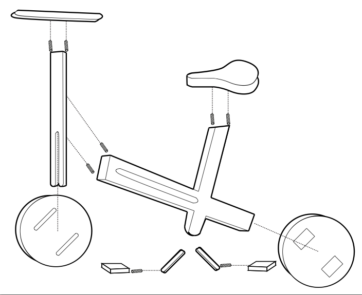
Above are the final instructions for the bike assembly. These would be engraved/ branded onto the bike, to save on printing and to prevent the use of plastics or inks, many of which cannot be recycled. We created how the Instructions would look, so they can be transferred onto the bike image, using photoshop.
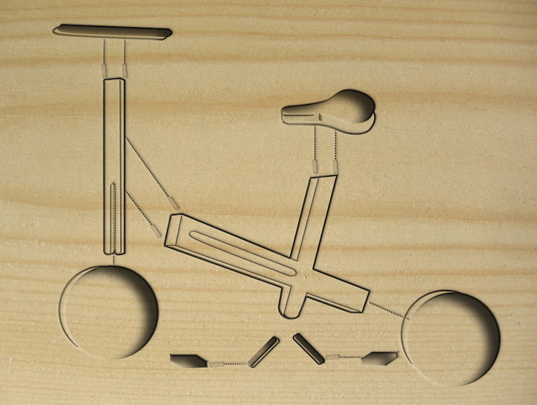
How the instructions will look, engraved onto the flat pack bike packaging (above).
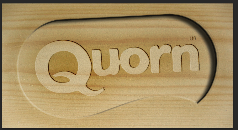
This is how the Quorn logo will look once it has been engraved onto the bike. We created a similar version of this earlier in the project, but since then have changed the type of wood we wanted to use; a lighter in colour and weight, a pine wood.
This is how the Quorn logo will look once it has been engraved onto the bike. We created a similar version of this earlier in the project, but since then have changed the type of wood we wanted to use; a lighter in colour and weight, a pine wood.
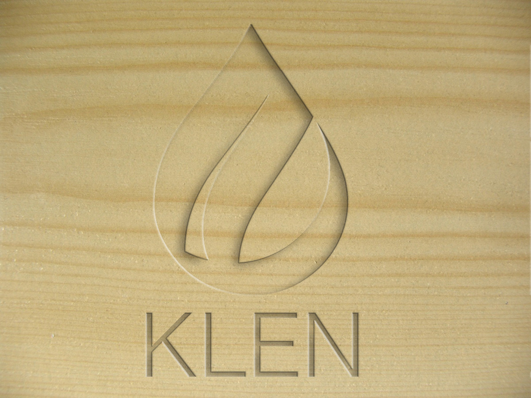
Finalising the logo. We decided to create a new logo, because the Quorn Klen bike is a separate sub brand from Quorn, so does not need to have a logo that looks exactly the same. The new Klen logo uses a water droplet with a slight gradient to show how the dirty, darker water changes into the clean, sky blue colour, representing the clean water.
We also needed to create a black logo which will make it easier to transfer onto the branded wood. The typeface, is Helvetica light, due to the fact we wanted one thats simple, and clean, again representing the ethos of the Klen bike.
We also needed to create a black logo which will make it easier to transfer onto the branded wood. The typeface, is Helvetica light, due to the fact we wanted one thats simple, and clean, again representing the ethos of the Klen bike.

Below is how the logo will look on the bike wood, once it has been engraved, by a template and a machine.
 RSS Feed
